ROUND HOLE, SQUARE PEG
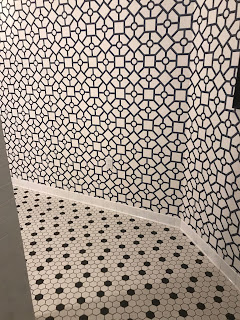
One of the many things I've been doing during this wretched quarantine is re-watching some of my favorite movies. One of those, THE HOLIDAY, has a line (referring to the relationship between two characters that never seemed to work); "we are like trying to fit a square peg into a round hole. This phrase can also describe many interior design disasters. TIP: if you think it's too much, it probably is. Take this new, hip boutique hotel I recently visited in Upstate New York. When I walked into the mens room I was shocked to see the combination of floor tiles and wallpaper, a mixture of octagons, circles and squares. Shocked doesn't quite describe the feeling...inducing vomit. Slightly more dramatic. I felt dizzy. I felt uncomfortable (and, no, I hadn't had my first martini yet). How on earth did this design meet up with the standards of this snooty establishment? The designer must have been trying to attempt a marriage of older (in the floor tile choice, a nod to the history of the Hudson Valley of NY) and more modern (in the wallpaper). Instead, well, it's just bad, over-complicated design. To fix this dizzy disaster, at the very least I'd place a wainscoting on the lower half of the wallpaper (traditionally about 3' high, I'd make it higher and cap it with a molding, paint it all stark white and only leave a small portion of the wallpaper exposed on the top portion. Or, better yet, remove he wallpaper entirely and just paint and add a few beautiful black and white images of the countryside outside. While I'm not a great mathematician, I do know that less is more.


