THE CONFUSED KITCHEN
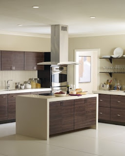
Where have I been, you might ask? While this time of year usually finds me obsessing about anything and everything holiday, I've been busy combing the northeast resourcing items for three very different kitchens I'm redesigning. HO HO HO has been replaced with YUK YUK YUK in most cases as I tread through deep, ugly design waters. One client in our initial meeting asked what my favorite design style was and was a tad shocked by my response; "anything that's comfortable!" Here's the thing, folks, you don't hire a designer (in most cases) because they love exactly what you love, you hire them because they have a keen sense of space, form, function and taste. Do I love modern design? Heck yes, but do I want to live in it every day? Nope. I also love more traditional elements and almost everything in between AS LONG AS IT'S COMFORTABLE. I'll never forget a holiday party I attended one year in the Hollywood Hills. My friends had been DYING to see this home (and so had I) and were all thrilled to be on the invite list. Once we stepped over the marble threshold and witnessed the breathtaking views of downtown LA and the Pacific Ocean, the enthusiasm died for me. Stark, freezing cold spaces with incredibly uncomfortable furniture made me wonder where the heck I would kick off my shoes with a bowl of popcorn and catch up on "Sex and the City." Something told me the homeowner wasn't too happy with it either as he called me a few months later to help redesign it. For one client this week I suggested they add a waterfall countertop design to their island and provided the image above as an example. It's seamless, modern and beautiful. What made me laugh and gave me pause after clipping the photo from a hip magazine, was once I examined the picture closely I noticed it was filled with contradictions. Typically, modern kitchen designs involve NOTHING any of us would normally use, and certainly never anything exposed on the countertops, so the canisters with flour and other items don't fit in this photo. Exposed shelving with plates and appliances are also a no-no in most modern spaces. It made me think back to that holiday party in LA where the owner thought he wanted ultra modern until life's necessities crept back in. My point, when designing any space, from mudrooms to kitchens, while clipping inspirational photos is necessary to communicate your aesthetic, you also need to keep practicality front and center. While many of us enjoy putting the cart before the horse, if that cart doesn't have wheels that work, what's the point?


