GOOD ON PAPER
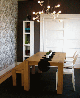
I try not to judge the creative processes of others, but sometimes I cringe at the design choices some people make. The other day, for example, I visited a potential client who was desperate to find solutions to spruce up her home, so called me to shed some light on her dark spaces. Now, I love everything retro, but this lovely lady thought "retro" and "contemporary" meant buying a Lazy Boy chair in a "bright color like ORANGE or AQUA." When I asked her to show me a favorite piece of furniture, she took me to a gold torch lamp with "clapper" controls (the hideous lamps that shoot light up and look like an over-sized microphone from a one-hit-wonder seventies group). Clearly, she needs my help. When I suggested wallpaper as a way of creating drama, texture and visual interest in her rooms, she acted like I suggested I wanted to plop the orange car from The Dukes of Hazzard in the middle of her living room. But, she trusted me, so I purchased a few rolls of paper from www.designpublic.com and placed it on one wall in her dining room and one in her bedroom. The end result, I think, is fresh, hip and totally far out!
DON'T GO NUTSO NO MATTER WHATSO!
If you want a big change you don't have to spend a fortune OR go totally nuts. Find a cool paper you like and place it on a small wall (look at previous blogs for my temporary paper that doesn't use glue or google it..comes right off when you want it to if you're nervous to commit to the real thing!). While I'm not a huge fan on painting only one wall in a room, one wallpapered wall is a different story entirely. If you have a tiny space, like a half-bath, I love to paper the entire thing, including the ceiling! I'll usually find a paper I like and let it dictate how the room will come together...in the dining room, for example, I found an earth-toned leaf-motif which allowed me to incorporate a natural wood table (with retro-mod chairs purchased from overstock.com).


