A Blank Slate...or Granite...or.....

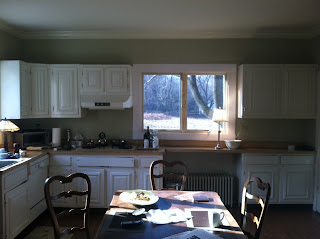
I mentioned last week an exciting new project I'm working on in a sassy little cottage on the Hudson River. The best part of a project like this, in my opinion, is the client. She is open to fresh ideas, she's hip and sassy, her place is adorable and she's done what I suggest many do before attacking a big project...MOVE IN and LIVE with the space before making major changes. When I met her late last summer (before her big move) we discussed knocking down walls, adding French Doors, etc. and now that she's had time to actually adjust to living in the space, her opinions about how she would like to use it have changed too. The last few houses I've lived in have had the same impact on my design choices where, upon first glance I might assume the flow and function should look a certain way, and after living in the space my design mind totally shifts to a new planet. And that is exactly what has happened here. Now, I'll admit this photo does not do this adorable cottage justice. The kitchen, located at the back of the house, is a large, open space of approximately 20' x 14' with one side serving as a sitting area and the other functioning as the kitchen, with cabinets against only one wall (well, they actually stretch onto another wall with only a minimal amount of counter space). Because it looks like a kitchen fit for a frat house or nursing home and with nothing in the middle of the room but beautiful wood floors, I'd call this a huge, clean slate. So, what do you think? What would you do? Because the client is single, loves to cook and entertain and prefers clean lines and modern surfaces, I've decided to throw out a few ideas like moving the radiator from under the window (in the center of the photo. Radiators, for the most part, can easily swing either way..like many politicians). The window provides a beautiful view of a field and the Hudson River, so it seems strange to have it wasted. Why not put the sink in that location? I'd also remove the cabinets above and replace them with simple shelving and a bead-board backdrop to maintain the integrity of the rest of the cottage. Rather than a stainless or colored dishwasher, I'd opt for a facade similar to whatever cabinetry she chooses (that way it will blend with the cabinets, creating the illusion of more space). Aside from the overall design of a space, it's also important to focus on how YOU want to feel in the space (I know, I'm getting very Oprah here, but stay with me..). Because this cottage is fairly small, each piece of furniture in it needs to serve multiple functions. The armoire placed in the kitchen, for example, is both beautiful but functions as plate and linen storage. One suggestion I will make is to add two fabric-covered chairs to this kitchen dining table situation. That way, when she has guests over she can pull the two fabric chairs into the adjacent living room for extra seating. Yet another way to mix more modern pieces with classic styles. Because I don't want to bust the budget, I went to overstock.com and found a few fantastic pieces for under $200! Also, Pier1 has amazing sales post holiday on furniture. Wow, this entry is about as scattered as I am, but you see what happens when you get excited about designing a space. So, here's how I start from scratch; I take a piece of paper (or create a word document) with the budget on top and make a list of MUST HAVE's (Stove, Refrigerator, etc.) and I create different price tiers; Viking Stove, Tier 1 (for most expensive), GE stove tier 3, etc. I call all manufacturers in our area to see availability and I jot down the contact person, phone number and date of availability on my grid. That way there aren't any surprises when I meet with my client. Want the Viking stove? Well, it's $5,000 and takes eight weeks to deliver. Is the GE looking better? So, here starts my first kitchen renovation of 2012. Let's see how it goes! Stick with me, email your ideas and check back for the progress.